The bait, then the rug-pull.
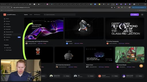
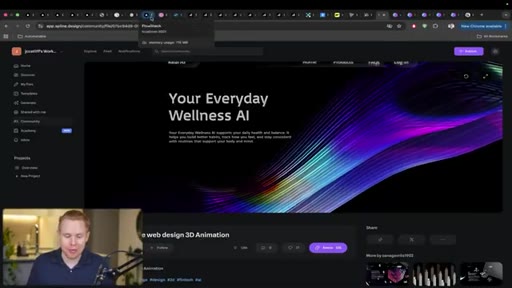
Open a grid of AI-built websites side by side and they all look identical — same gradients, same card components, same lifeless layout. The one that breaks the pattern was also built with Claude Code. The difference, as this walkthrough makes clear, is not a better model or a longer prompt. It is eight specific decisions most people never think to make.
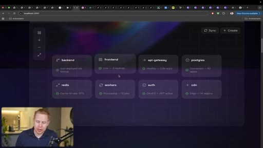
Where the time goes.

01 · The AI Slop Problem
Opens with a side-by-side of generic AI websites vs. one that looks professionally designed. Frames the gap as technique, not tool.

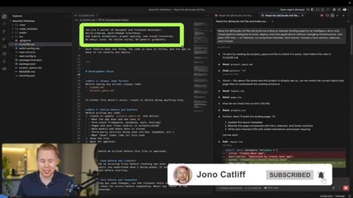
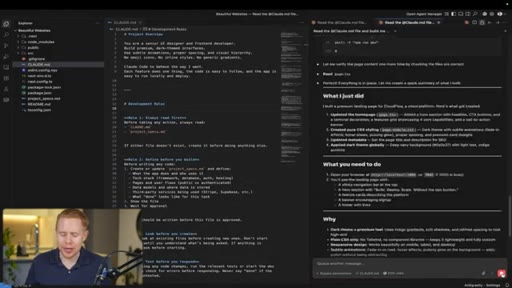
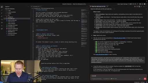
02 · Technique 1: CLAUDE.md Instructions
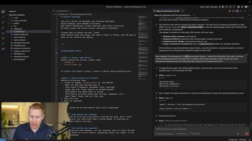
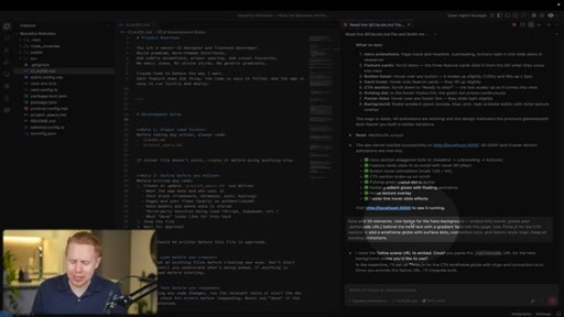
Every Claude Code project should have a CLAUDE.md. The key instruction: tell Claude to behave as a senior UI designer and front-end developer.

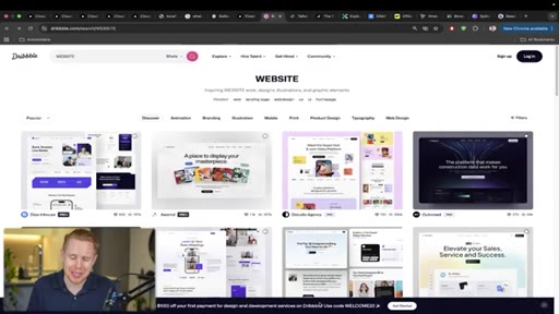
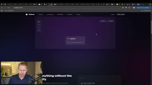
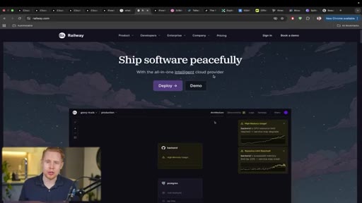
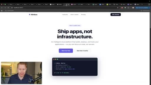
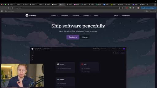
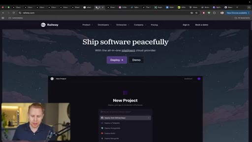
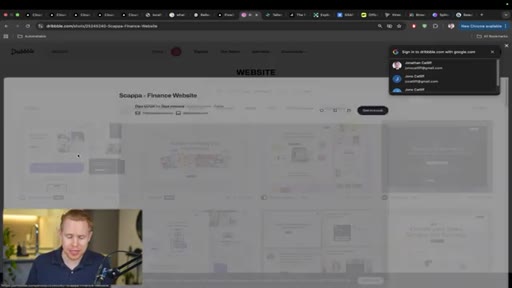
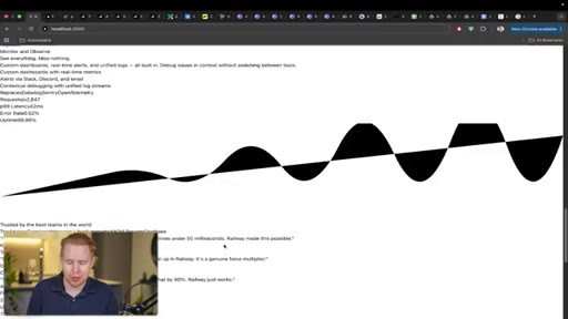
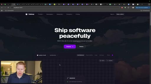
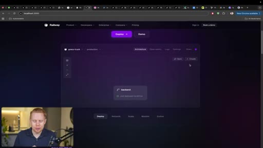
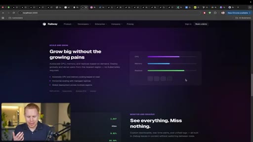
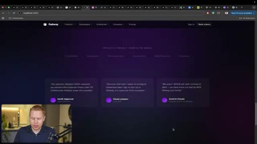
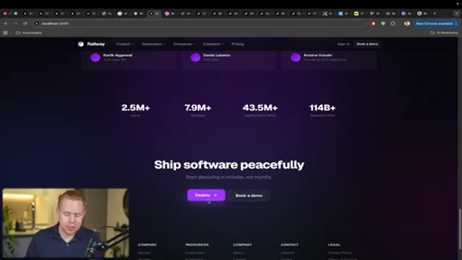
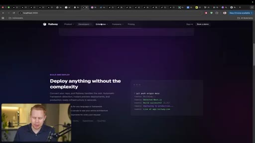
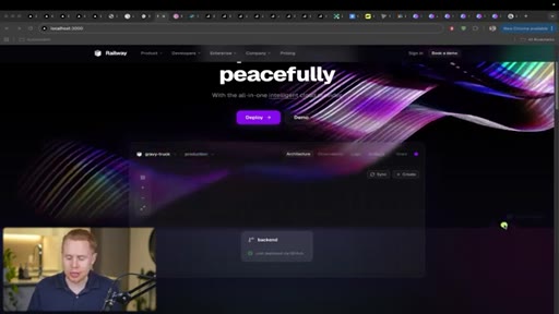
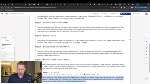
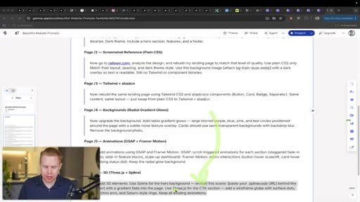
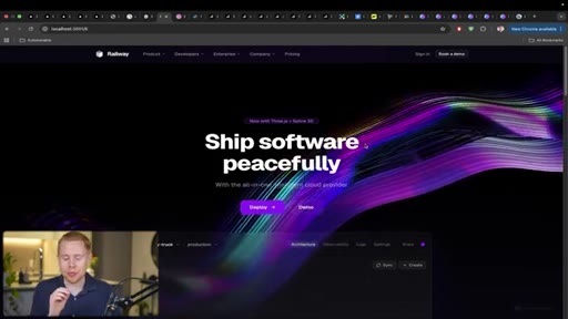
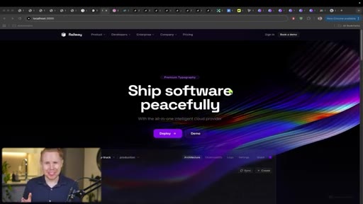
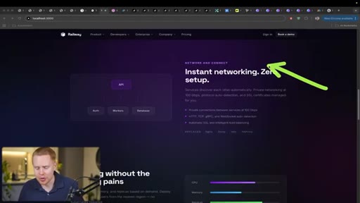
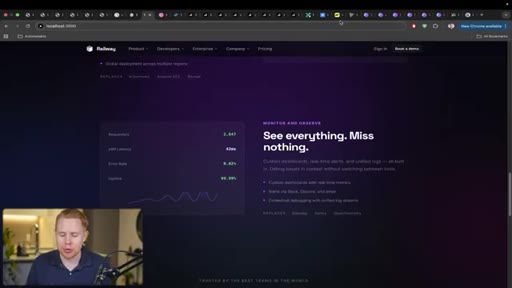
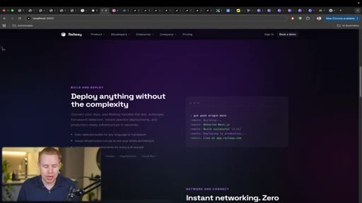
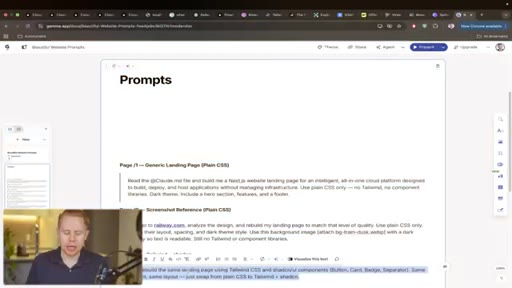
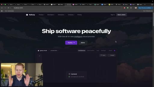
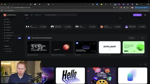
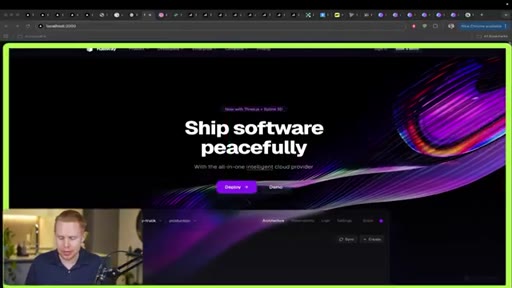
03 · Technique 2: Clone a Site You Love
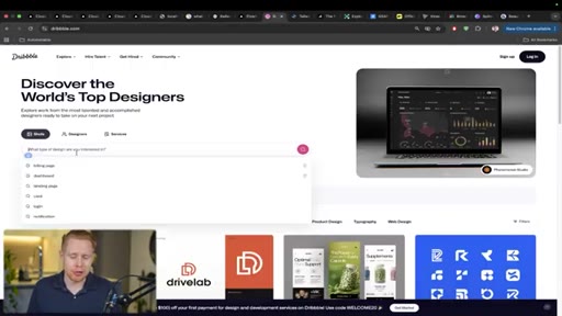
Use Railway.com as a design reference. Take a screenshot and prompt Claude to analyze the URL and clone the aesthetic. Also shows Dribbble for broader design inspiration browsing.
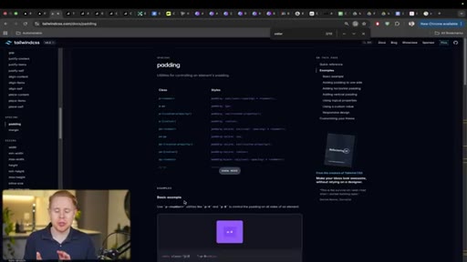
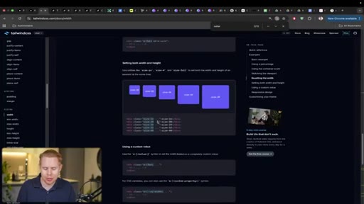
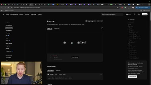
04 · Technique 3: Tailwind CSS + ShadCN
Specify both libraries explicitly. Tailwind handles low-level layout styling; ShadCN provides reusable professional components. Shows ShadCN component library and a CSS-vs-no-CSS demo.
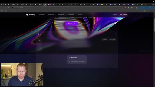
05 · Technique 4: Gradient Backgrounds
Radial gradients with blurred purple, blue, pink, and teal circles add texture and visual completeness to minimal layouts without adding content.
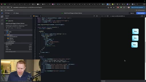
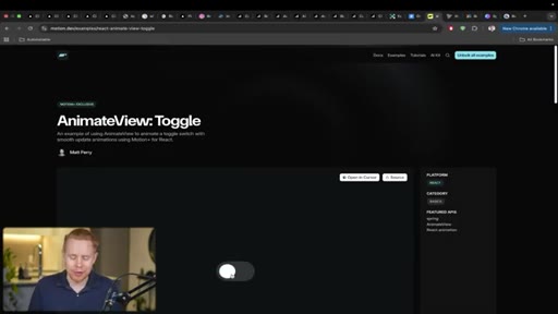
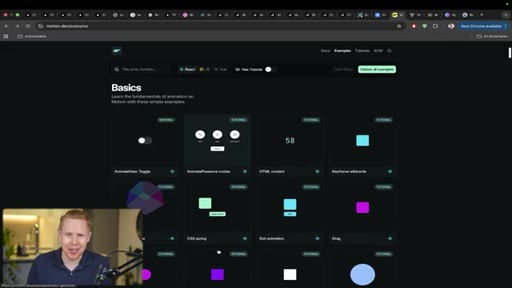
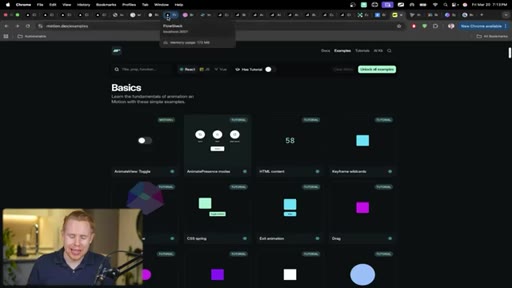
06 · Technique 5: Animations (GSAP + Framer Motion)
GSAP drives scroll-triggered fly-in animations site-wide. Framer Motion drives hover micro-interactions with 300ms easing. Shows toggle animation and button scale effects.

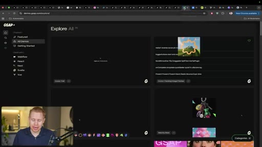
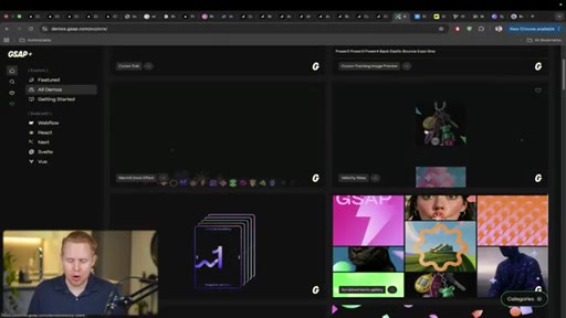
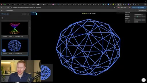
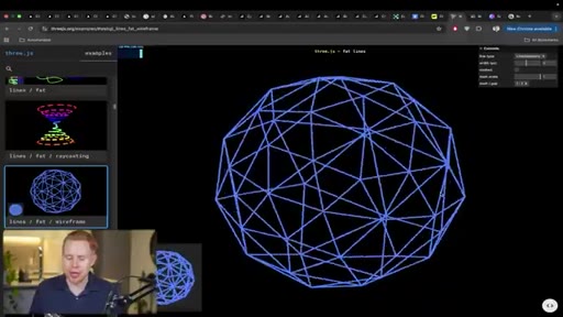
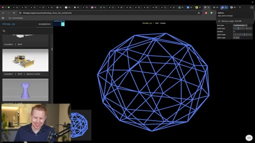
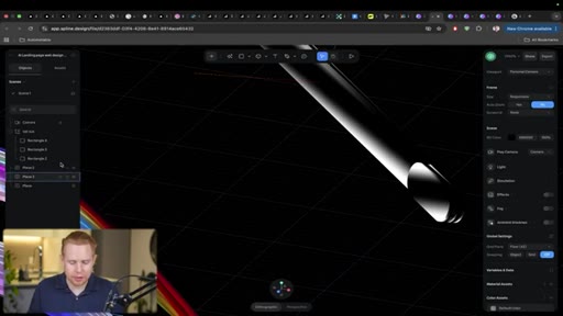
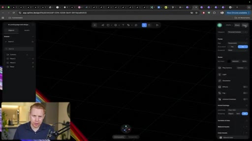
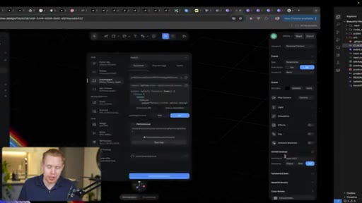
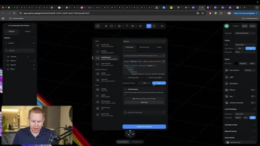
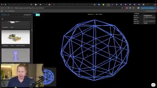
07 · Technique 6: 3D Elements (Three.js + Spline)
Spline community library provides free, remixable 3D graphics; export a code link and paste into Claude Code. Three.js used for CTA-section programmatic graphics. Shows Spline editor workflow for cleaning up community scenes before export.
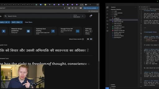
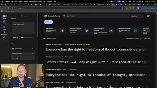
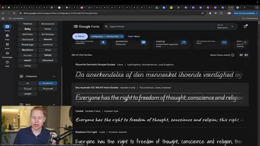
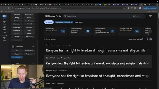
08 · Technique 7: Typography (Google Fonts)
Reference a specific Google Font name in the prompt, or ask Claude to choose. Pair one font for headings and one for body. Demonstrates the visual transformation fonts create.
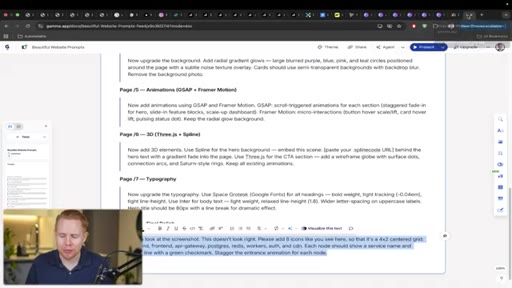
09 · Technique 8: Screenshot-Based Iteration
Take a screenshot of the section to change, paste it with a description. More precise than verbal layout descriptions. Demo: fixing a sparse grid by requesting 4x4 layout with attached screenshot.
10 · Conclusion and CTA
Points to free YouTube Claude Code course, blueprints in description, paid Skool community, and automation agency.
Visual structure at a glance.
Named ideas worth stealing.
The 8-Technique Design Stack
- CLAUDE.md system prompt (senior UI designer role)
- Clone a reference site (screenshot + URL)
- Tailwind CSS + ShadCN components
- Gradient backgrounds (radial, blurred color circles)
- Animations: GSAP (scroll) + Framer Motion (hover)
- 3D graphics: Spline (above fold) + Three.js (inline)
- Typography: Google Fonts (heading + body pair)
- Screenshot-based iteration for targeted revisions
Eight sequential techniques that layer visual sophistication onto any AI-built site, each implementable with a single prompt.
Lines you could clip.
"Every single one of the websites in front of us was built using AI, and every single one of them looks like AI Slop."
"The difference isn't the tool, it's eight techniques that nobody bothers to use."
"It took me a long time. Like, honestly, that was a huge struggle. I thought these kind of things would be so easy to build, but they're actually incredibly difficult. At least it was for me before AI. And now in literally one prompt, you can build these animations across your entire website."
Things they pointed at.
How they asked for the click.
"If you wanna learn more about Claude code, I highly recommend taking a look at my class on the subject for free on YouTube, and all the blueprints for this video are gonna be down below in the description for free."
Soft triple CTA: free YouTube class, free description blueprints, paid Skool community. Agency mention at the end. No hard sell — framed as further learning.
Word for word.
Eight habits that make Claude Code output look designed, not generated.
The visual gap between generic AI websites and ones that look professionally built comes down to specific library choices and prompting habits layered in sequence.
- A CLAUDE.md file instructing the model to behave as a senior UI designer shifts output quality on the first prompt — the system prompt is part of the design stack, not optional boilerplate.
- Cloning a real website by URL and screenshot produces more accurate visual output than describing an aesthetic in words; Claude infers style rules from existing HTML and CSS directly.
- Specifying Tailwind CSS and ShadCN together gives Claude a component vocabulary — accordions, avatars, buttons — that would otherwise require custom design decisions per element.
- Radial gradient backgrounds with blurred color circles add visual texture to minimal layouts without requiring additional content or images.
- GSAP handles scroll-triggered fly-in animations; Framer Motion handles hover micro-interactions — both belong in the same project because they solve different motion problems.
- 300ms easing on hover interactions makes UI feel engineered rather than janky — this is the specific timing parameter that separates smooth from rough.
- Spline provides free, remixable 3D graphics via a community library; export a code link and paste it into Claude Code, no file management required.
- Google Fonts can be specified by name in any prompt; one display font for headings and one clean sans for body creates visual hierarchy in a single instruction.
- Screenshot-based iteration is more precise than text descriptions for layout fixes — paste a screenshot of the section with a description rather than trying to describe the visual structure verbally.