The bait, then the rug-pull.
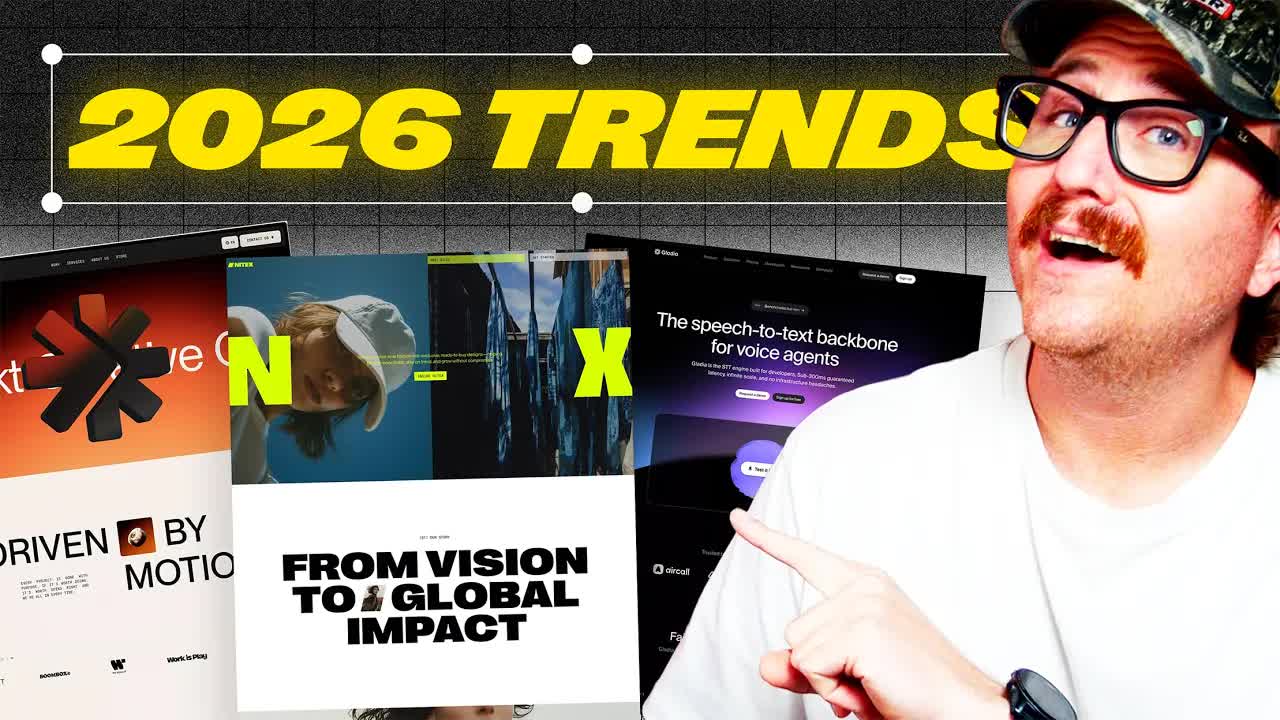
Nine trends. Hundreds of sites tracked. One rule that overrides all of them. The host has been watching where design money flows — and the patterns heading into 2026 are clearer than most designers expect.
Where the time goes.
01 · Introduction
Promise: nine trends spotted across hundreds of sites, patterns becoming clear.
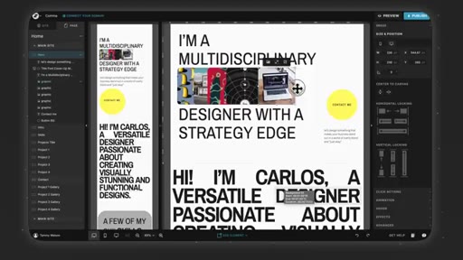
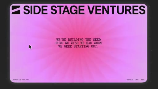
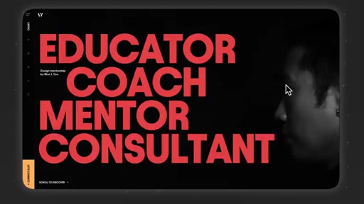
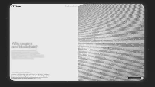
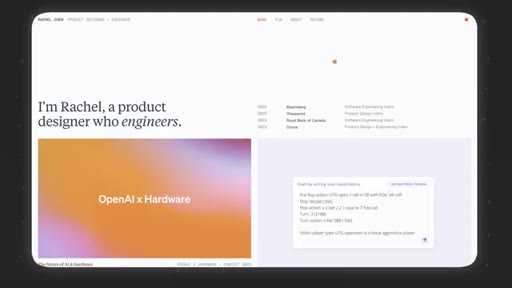
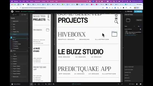
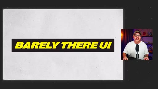
02 · Trend 1: Barely There UI
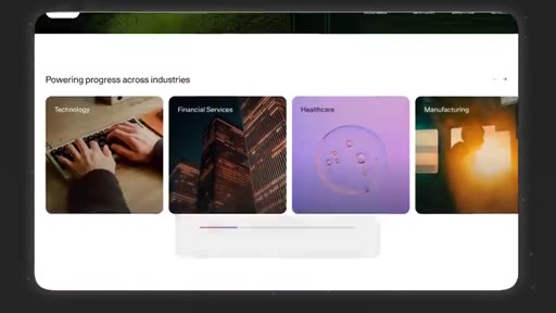
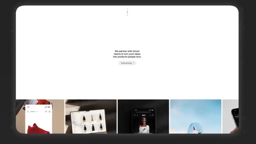
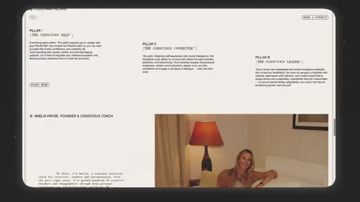
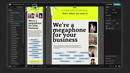
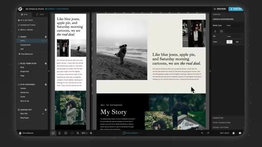
AI-company minimalism spreading to all design: skinny sans-serifs, white space, data graphs, single-font palettes.
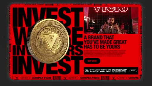
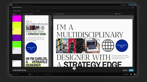
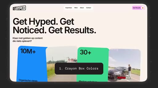
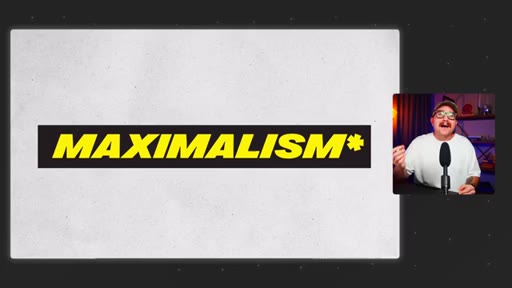
03 · Trend 2: Maximalism*
The counter-reaction that pulled back — big fonts, bright colors, visual chaos but restrained by AI minimalism dominance.
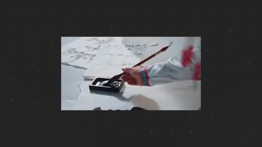
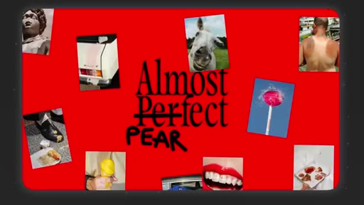
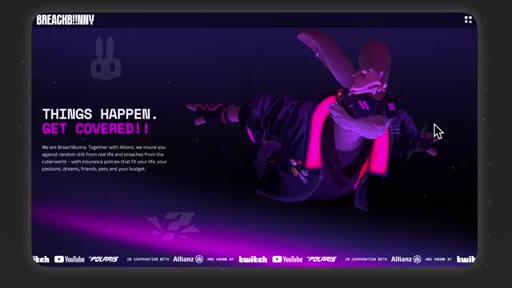
04 · Trend 3: Human Touch
Wabi-sabi design: hand-drawn elements, unpolished photos, paper textures, rough illustrations. Extreme variant: anti UX.
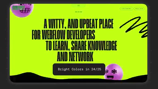
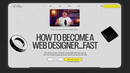
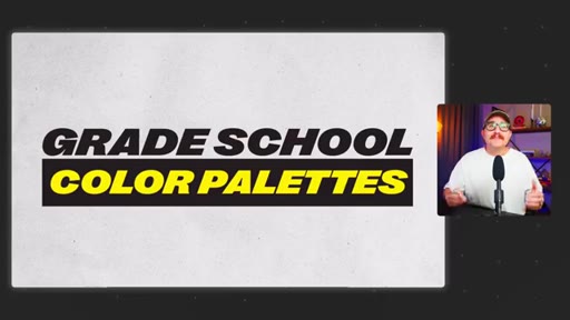
05 · Trend 4: Grade School Color Palettes
Neon fatigue drives shift to Crayola-era basics with interesting tints. Dominant color: warm orange with red lean.
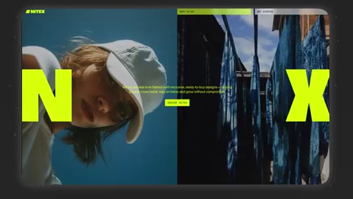
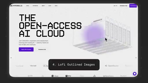
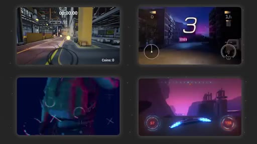
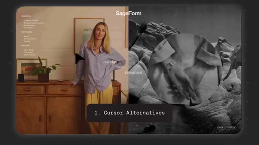
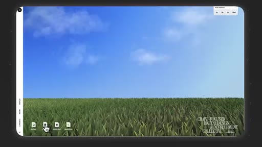
06 · Trend 5: Spaceship Instruction Manual
Blueprint layouts with decorative lines, meaningless labels, lo-fi drawings, monospace fonts — strong for technical products.
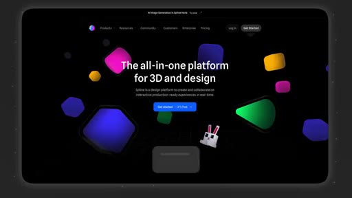
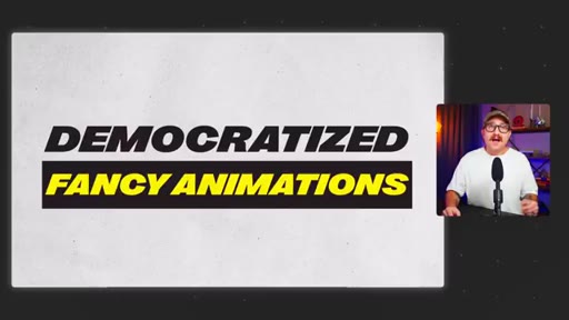
07 · Trend 6: Democratized Fancy Animations
WebGL and 3D visuals now accessible via Spline, Unicorn Studio, Rive. Best use is storytelling, not decoration.
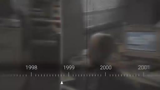
08 · Trend 7: Internet Nostalgia
Early-2000s web aesthetic driven by millennial decision-makers: custom cursors, blocky UI, ASCII art, old-computer experiences.
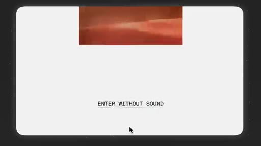
09 · Trend 8: The Tab That's Playing Music
Websites adding micro-interaction sound. Phones trained users to expect sonic feedback — it is spilling to web.
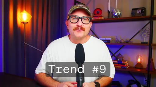
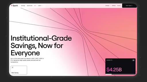
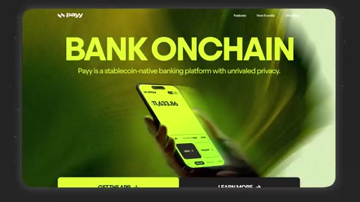
10 · Trend 9: Tech Bro Gradient
Purple/blue/teal soft gradients as the SaaS/AI startup uniform. Easy but becoming invisible — stand out by modifying combos or shapes.
11 · Conclusion
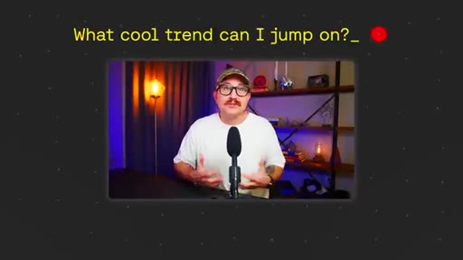
Reframe: the question is not which trend to jump on but what skills make every design decision serve the site and client.
Visual structure at a glance.


Named ideas worth stealing.
The Fit Test
Before applying any trend, ask: does this fit the overall brand and goal of this website? Applied consistently across all nine trends.
Nine 2026 Web Design Trends
- Barely There UI
- Maximalism*
- Human Touch
- Grade School Color Palettes
- Spaceship Instruction Manual
- Democratized Fancy Animations
- Internet Nostalgia
- The Tab That's Playing Music
- Tech Bro Gradient
Named shortlist of visual patterns spotted across hundreds of sites heading into 2026.
Lines you could clip.
"Just because you can do it doesn't mean you should."
"Our clients don't need award-winning websites. They just need sites that help their businesses."
"The question isn't what cool trend can I jump on, but what skills do I need to make sure that whatever I'm doing, I'm making decisions that serve the website or the client the best."
How they asked for the click.
"I've got a video that covers every skill that you need to be in the top 1% of web designers."
Soft pivot at the end — reframes the trend content as incomplete without skill-building, then points to another video. No hard sell. Effective because it logically follows the closing argument.
Word for word.
Design trends are only correct when they fit the site.
Every visual trend in 2026 has a legitimate use case and an equally legitimate reason to skip it — the decision hinges on brand fit and site goal, not what looks current.
- AI company aesthetics have made hyper-minimalism the new default starting point, which means every designer is now fighting to justify complexity rather than whitespace.
- The strongest signal of originality in 2026 is one deliberate human imperfection — a hand-drawn element, an unpolished photo — because AI-generated smoothness is now cheap and ubiquitous.
- Neon and loud color palettes peaked and collapsed within two years, a useful reminder that the internet fatigues visual trends faster than any other medium.
- WebGL animations and 3D visuals are now democratized tools, not differentiators — the differentiator is using them to tell a story rather than to perform technical capability.
- Sound on websites is growing, not shrinking, because mobile trained users to expect sonic feedback from interactions — designing without it may start to feel broken.
- The tech-bro gradient has become so ubiquitous that using it without modification signals a lack of intentionality rather than technical sophistication.
- The filter that survives every trend cycle is the same: does this serve the website and the person using it, or does it serve the designer's desire to look current?