
The bait, then the rug-pull.
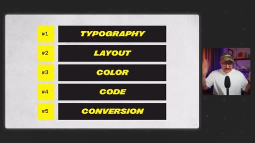
Ten years of reading books, taking courses, and building websites — and it comes down to five things. Not fifty. Not a platform, not a trend, not the latest AI tool. Five durable skills that every working professional actually uses, and that most beginners skip entirely in favor of chasing what looks impressive.
Where the time goes.

01 · Cold open and promise
States the premise: after 10 years, only 5 skills matter. Names the outcome the viewer will have by the end.

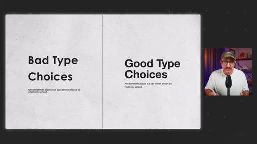
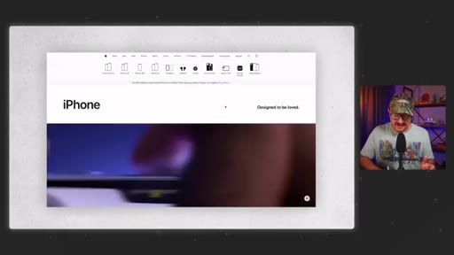
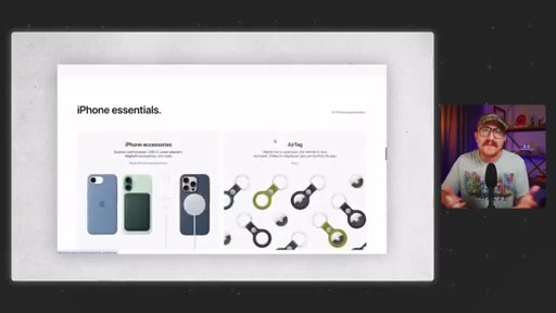
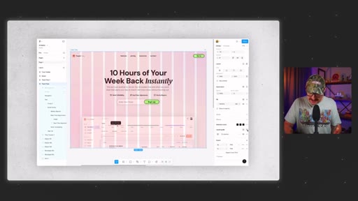
02 · Skill 1: Typography
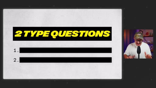
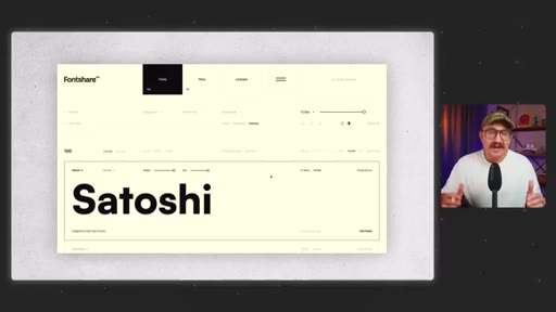
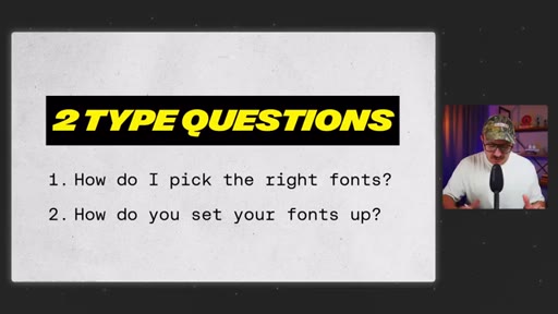
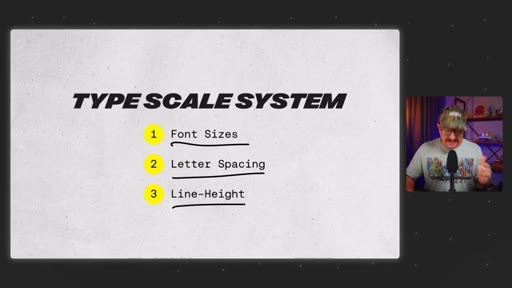
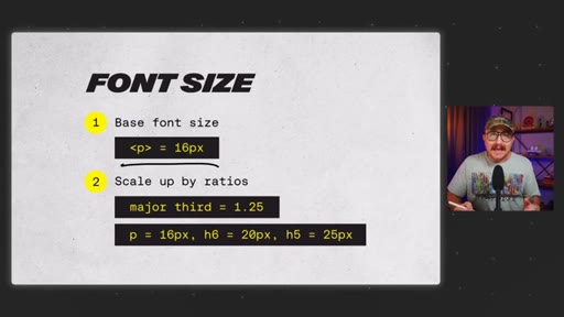
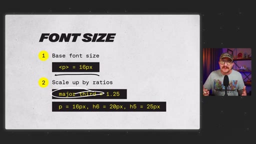
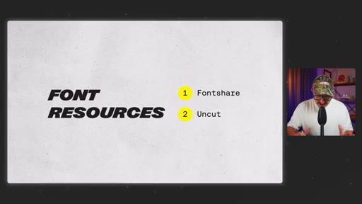
Two questions: how to pick fonts (fontshare, uncut.wtf) and how to set them up (major third type scale, REM values, letter spacing, line height). typescale.net as a shortcut.
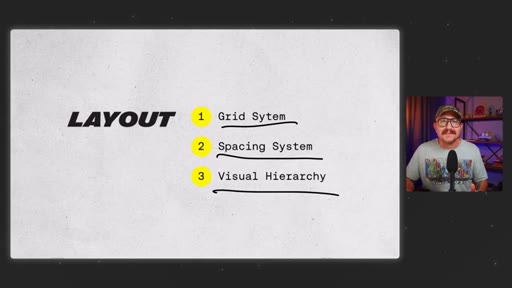
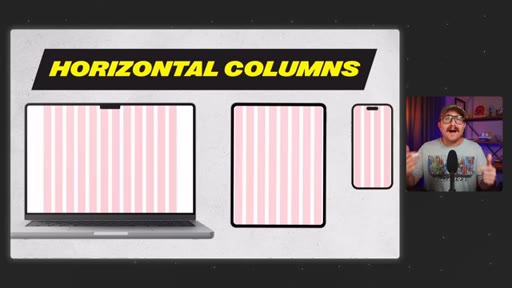
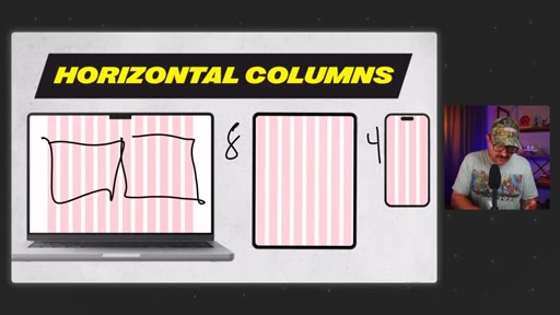
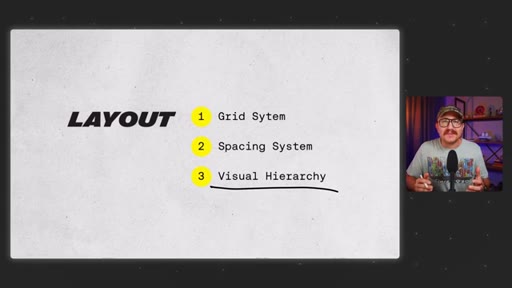
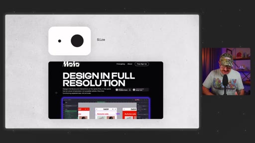
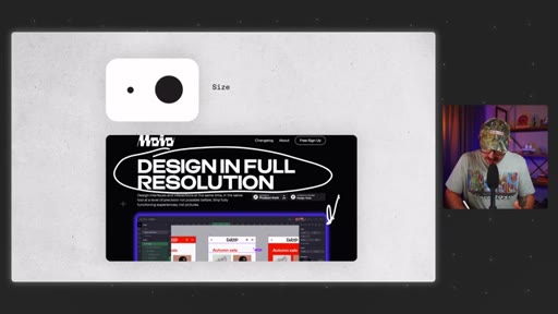
03 · Skill 2: Layout
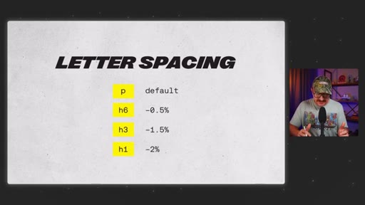
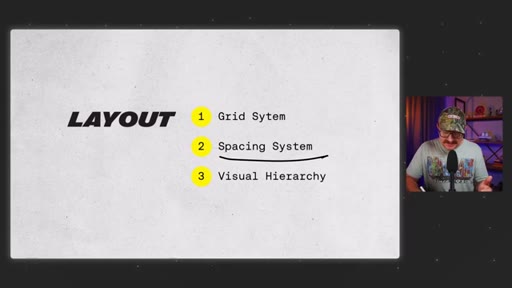
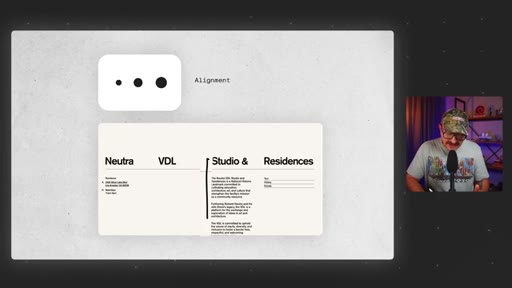
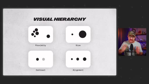
12-column grid on desktop, 8-column tablet, 4-column mobile. 8-point grid for spacing. Four visual hierarchy principles: proximity, size, contrast, alignment.
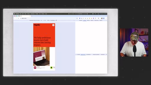
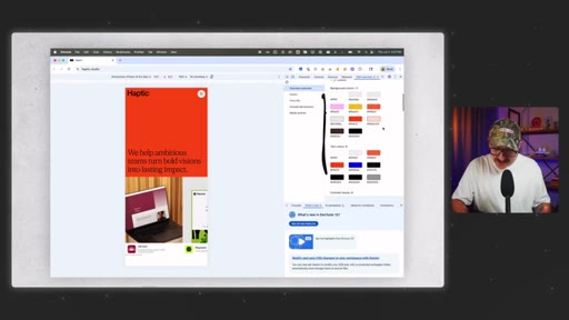
04 · Skill 3: Color
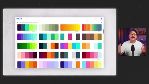
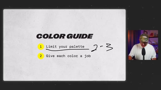
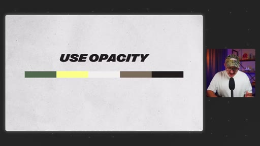
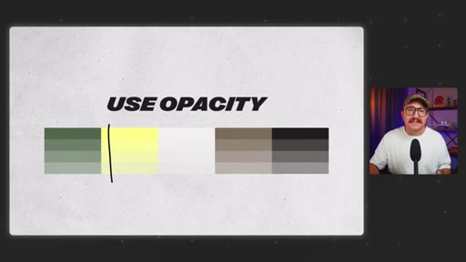
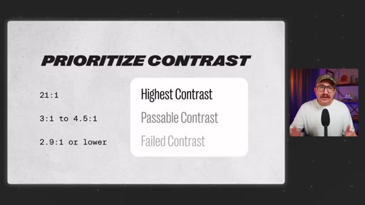
Limit palette to 2-3 colors. 60-30-10 rule for balance. Use opacity instead of adding colors. Prioritize contrast ratios. CSS Overview to steal palettes from professional sites.

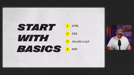
05 · Skill 4: Code basics
HTML, CSS, JS, PHP basics are enough. Learn 80% via courses, vibe code the rest with snippets and AI.
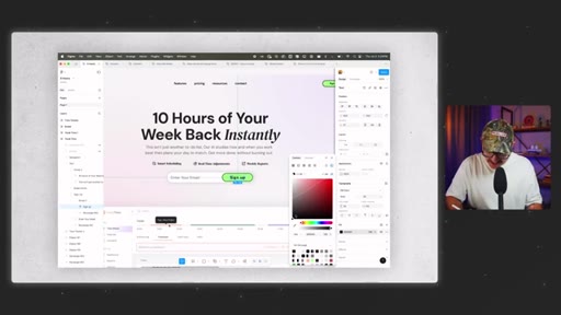
06 · Skill 5: Conversion
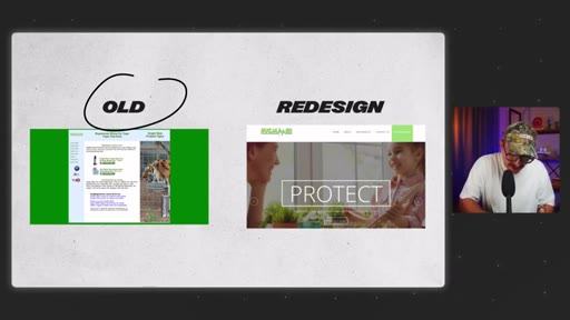
Pro designers design for action, not looks. Personal story: redesign that tanked a client's sales by ignoring the user journey. One goal per page. CTAs in hero + nav + every 2-3 scrolls. Trust, clarity, and feelings.
07 · Conclusion
Permission to stop chasing everything. Focus on these five and grow faster than chasing trends.
Visual structure at a glance.
Named ideas worth stealing.
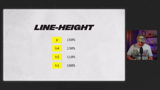
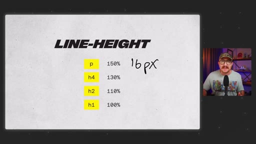
Major Third Type Scale
- Base: 16px
- H6: ~20px
- H5: ~25px
- H4: ~31px
- H3: ~39px
- H2: ~49px
- H1: ~61px
Scale each heading ~25% larger than the previous using REM values. typescale.net generates the full system automatically.
8-Point Grid System
- 8px
- 16px
- 24px
- 32px
- 64px
- 128px
- 256px
All spacing in multiples of 8. Used by Google Material Design and Apple. Set up in Figma as a grid guide.
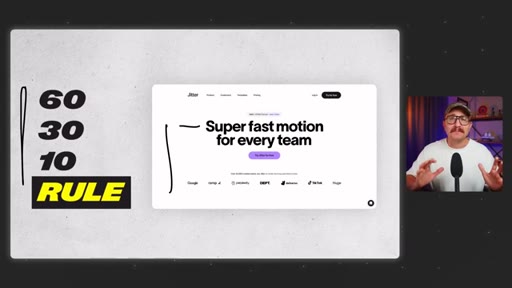
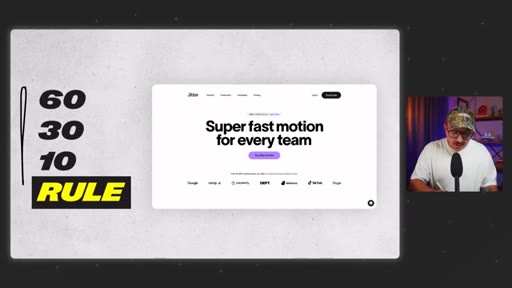
60-30-10 Color Rule
- 60% neutral (backgrounds, body text)
- 30% secondary (section backgrounds, cards)
- 10% accent (buttons, CTAs)
Assigns a percentage and a job to each color in a limited palette, preventing visual chaos.
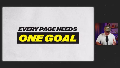
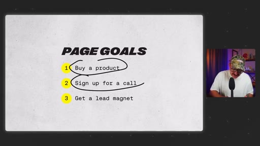
Single-Goal Page Architecture
Every page has one goal: buy a product, sign up for a call, or capture a lead magnet. Multiple goals split user attention and reduce conversion.
Know, Like, Trust, Feel
Extension of the classic KLT framework — adds feel as the emotional layer that moves people from interest to action.
Lines you could clip.
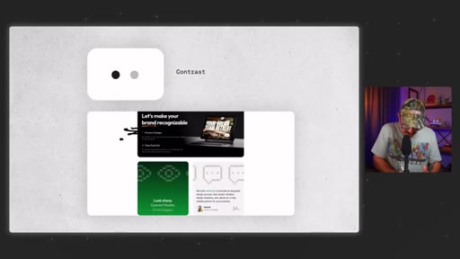
"Pro designers don't use more color. They use color more intentionally."
"One good color used well beats five random colors any day."
"Pro designers don't guess about where things should go on the page. They have systems that guarantee it every time."
"I had focused so much on the design that I ignored the user journey."
"People don't read websites. They scan them."
Things they pointed at.
How they asked for the click.
"If this video was helpful, make sure to hit that like button and subscribe so you don't miss another episode."
Soft, friendly close CTA. Mid-video CTA at ~1:39 for likes/subscribe plus slide download and font resource list.
Word for word.
Five systems that make web design feel intentional.
Confidence in web design does not come from knowing more tools — it comes from having repeatable systems for typography, layout, color, code, and conversion.
- Font selection matters more than most designers realize — overused free fonts make designs blend in, while independent repositories like fontshare.com offer high-quality alternatives that actually differentiate client work.
- A type scale system based on a consistent ratio (the major third scales each level roughly 25%) eliminates guesswork and makes every typographic decision feel deliberate rather than eyeballed.
- Spacing should never be arbitrary — the 8-point grid system, used by both Google and Apple, ensures all margins and padding are multiples of 8, producing instant visual rhythm without manual calculation.
- Color palettes work best when limited to two or three roles: neutral for backgrounds and text, secondary for structure, accent for calls to action — adding more colors introduces visual noise without adding clarity.
- Using opacity variations of a single primary color creates tonal range more coherently than expanding the palette — one well-chosen color at varying opacities reads as a system, not a collection of guesses.
- Color contrast is not optional — small text below 4.5 to 1 contrast fails most users under typical screen conditions, and Figma's built-in checker makes verification a single click.
- Code fluency for designers does not mean writing applications from scratch — it means knowing enough HTML, CSS, and JavaScript to modify existing solutions and use AI to close the remaining gap.
- Conversion is the skill most often missing from visually polished work: a redesign that improves aesthetics while ignoring user flow can actively reduce sales, because beauty and usability are not the same objective.
- Every page should serve exactly one goal — buy, call, or capture — with CTAs visible immediately on load and repeated at regular scroll intervals throughout the page.