Self-Made Web Designer · Youtube · 07:14

Give Me 7 Minutes & Your Web Design Skills Will Take Off

A 7-minute crash course that packs a decade of web design knowledge into three pillars, a conversion warning, and a survival rule for the AI era.

Posted
February 13th 2025
1 year ago
Duration
07:14
Format
Tutorial
educational
Channel
SW
Self-Made Web Designer
§ 01 · The Hook

The bait, then the rug-pull.

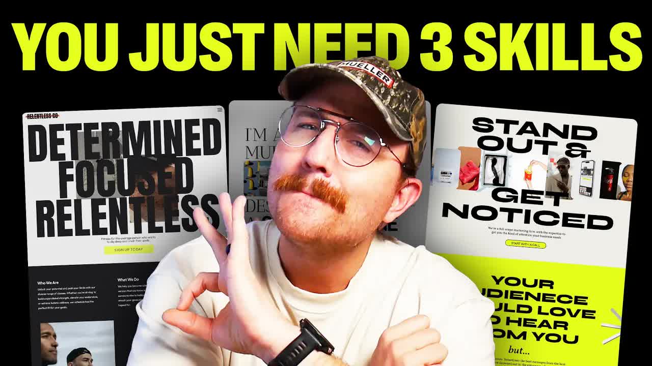
Ten years of web design knowledge in seven minutes is an audacious promise. The host earns it by spending the first thirty seconds dismantling a myth almost every designer was taught — then delivering a framework so clean it fits on a napkin.

§ · Chapters

Where the time goes.

00:00 – 00:10

01 · Hook

Direct promise: 10 years of knowledge in 7 minutes, no fluff.

00:11 – 01:07

02 · Debunking the F-Pattern

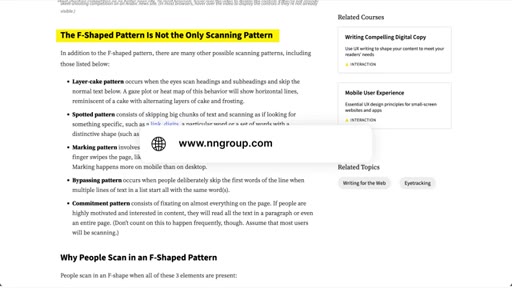
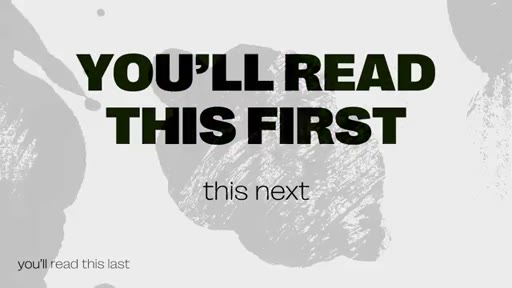
The F-pattern reading model is outdated and actively harmful — forces users to miss content. Replace with visual hierarchy.

01:05 – 02:15

03 · Visual Hierarchy and CTAs

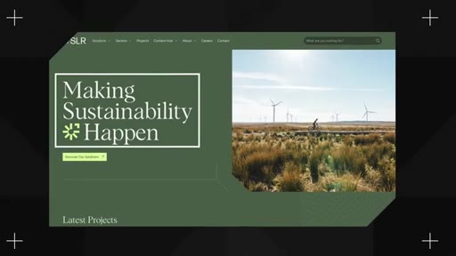
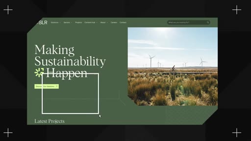
Make the most important elements biggest and boldest. CTAs need maximum contrast. Ghost buttons are invisible — stop using them.

02:16 – 03:34

04 · Color

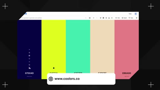
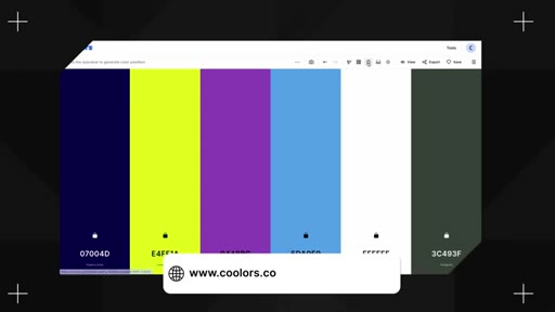
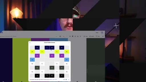
Accessibility contrast is non-negotiable. Use coolers.co to check. Apply the 60/30/10 rule for color distribution.

03:34 – 04:28

05 · Typography

H1 is the most prominent text on the page. H2 divides sections. Paragraph text must use readable fonts.

04:29 – 05:01

06 · The Pretty Website That Killed Sales

Host admits to designing a beautiful site for a client that caused sales to plummet — pivots the video to conversion.

05:01 – 05:57

07 · Conversion Framework

Three conversion levers: Clarity, Scannability, Motivation.

05:57 – 06:35

08 · Design for the Audience

Design based on target audience research, not personal or client taste.

06:35 – 07:09

09 · AI Warning and Stay Current

Web designers go stale like bread. AI will replace lazy designers. Continuous learning is the only defense.

07:09 – 07:14

10 · CTA

Subscribe prompt, next video link, sign-off: if you don't quit, you win.

§ · Storyboard

Visual structure at a glance.

open
debunk
hierarchy graphic
color examples
conversion pivot
clarity-scan-motivation
AI warning
CTA
§ · Frameworks

Named ideas worth stealing.

01:05 concept

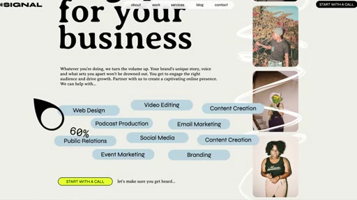
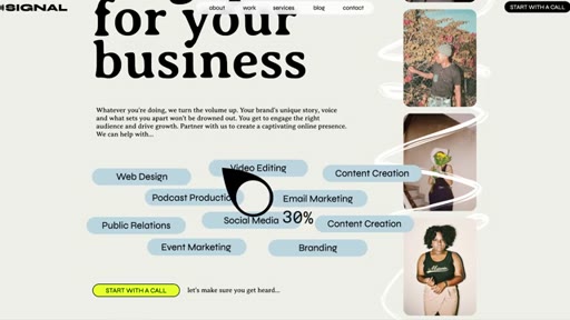
Visual Hierarchy by Volume

Make the most important element biggest and boldest; for every less-important element, turn down the volume by reducing size, weight, or contrast progressively.

Steal for any landing page or sales page layout
02:48 list

60/30/10 Color Rule

  1. 60% dominant neutrals (blacks, whites, grays)
  2. 30% brand color
  3. 10% accent color (CTAs, highlights)

A color distribution guideline that keeps sites balanced while reserving maximum attention for interactive elements.

Steal for any brand color system or design system
05:01 list

Conversion Triad

  1. Clarity — who you are and what the user should do next
  2. Scannability — structure that lets users bounce around and make decisions
  3. Motivation — speak to the emotional driver behind the yes or no

Three conversion levers that determine whether a well-designed site actually produces results.

Steal for client website audits, landing page critiques, design briefs
§ · Quotables

Lines you could clip.

06:05
"Web designers don't age like fine wine. We age like a loaf of bread left on the counter."
standalone metaphor, no setup needed → TikTok hook
06:43
"Will AI take lazy web designer jobs? Absolutely."
two-line call-and-response, punchy close → IG reel cold open
04:47
"I tried to make it look pretty instead of focusing on good conversion practices."
personal confession that reframes the whole field → newsletter pull-quote
§ · Resources Mentioned

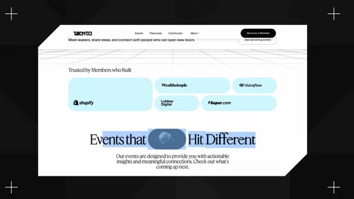
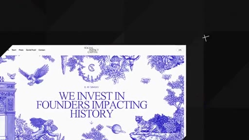
Things they pointed at.

§ · CTA Breakdown

How they asked for the click.

07:09 next-video
"I've got another video that I'm gonna link to that's gonna answer just those questions"

Soft and helpful — frames the next video as the natural continuation. Closes with branded sign-off: if you don't quit, you win.

§ 04 · The Script

Word for word.

HOOK opening / re-engagementCTA the pitch
00:00HOOKI'm gonna give you over ten years of web design knowledge in just seven minutes. No fluff, just the good stuff.
00:08HOOKAre you ready? Let's go. You can basically boil all the design knowledge that you need to build great websites down to just three things,
00:18layout, color, and typography.
00:21Probably heard it said before that people read or engage websites in somewhat of an f pattern. So they start reading at the top left, and then they go right, they come back, they go down on the left, they go right, they come back, and they go down on the left until they're done.
00:36But here's the truth. That's actually bogus.
00:40It's outdated information that web designers just kind of keep repeating until everybody thinks it's true. I might have been one of those web designers and for that I apologize. The truth is is that people engage
00:53with websites in all sorts of different patterns and forcing them to pay attention in an f pattern might actually cause them to miss important information. So what do you do instead? You use something called visual hierarchy.
01:08You've probably seen an image before where there's this big bold line of text that says you're gonna read this first and the smaller line underneath it says then you'll read it next. And then this really tiny line that's all the way in the left hand corner that says and you'll read this last. That is visual hierarchy.
01:26You make the most important elements of a section the biggest and the boldest, and then for each other element that isn't maybe as important, you turn down the volume. You make it more inconspicuous. For your call to action or buttons, you wanna make sure that they have a high degree of contrast from everything else around them.
01:45Why? Because the main thing we want people to do on a website is click a button. If it doesn't stand out, it's gonna make it harder to do that.
01:53And please, I beg of you, stop using ghost buttons. What are ghost buttons? They're buttons that just have an outline without a solid background.
02:02The problem is that people don't see them and they don't click on them. For colors, every website should have a color palette that matches the brand of the website owner. Here's a few important things to consider when it comes to color.
02:16The first thing is accessibility. If you pick colors that make it difficult to read text or tough to see elements clearly, it's going to be hard for users to engage. You wanna pick colors that have a high enough contrast that even users with visual impairments
02:33are still going to be able to see things clearly. How do you know if a contrast is high enough? Something that I like using is a website called coolers.co.
02:43You can actually take all of the brand colors from a website, input it into the dashboard, click on the color contrast teller, and it will instantly tell you which colors pass and which don't.
02:54Super helpful tool. Another good rule of thumb for colors is that you wanna use a guideline called the sixty thirty ten rule. Basically, this means is that about 60% of your website should use your dominant colors, things like grays or blacks
03:09and whites. 30%, you should reserve for your brand colors, and then another 10% you wanna use something
03:16for an accent. So helping things really stand out. That's a great thing to use for like your calls to actions or your buttons.
03:25Is this a hard and fast rule that you absolutely have to use every single time? No. But it's a good principle to stick with, especially when you're first getting started.
03:33Then there's typography. Typography is one of the most underrated design elements of a website, but it has a massive impact on the readability and user experience. Thankfully, there's a ton of great options when it comes to fonts.
03:47You've got serifs, you've got sans serifs, you've got handwritten fonts, you've got scripts, you've got display, you've got monospace, and it goes on and on. There are three main text elements to consider for your website.
04:00You've got your h ones or your main headers, and this should be the biggest most prominent text on the page. This is gonna describe what the entire page is all about. Then you've got your h two or your subheadings.
04:12These act as ways to divvy up the rest of the page and guide a user's attention.
04:19Then finally, you've got your paragraph text or your p tags. You don't wanna use really decorative text for this. It might look cool, but it kills readability.
04:29But here's the thing, good design without good conversion practice doesn't actually help your clients. I designed a website a while back for a client and the result was way better than their old website. It was clean.
04:41It was modern. It was chef's kiss. The problem was when we launched it, sales plummeted.
04:47Why did that happen? It's because I tried to make it look pretty instead of focusing on good conversion practices. If your design doesn't consider conversion,
04:57it's useless to your clients. So what are good conversion practices? Good conversion is all about reducing friction for users.
05:05You wanna make it stupid easy for the users to find what they're looking for and to go through and either buy a product or sign up for a service. And that's done through clarity. You wanna be crystal clear about who the company is or if the person is who owns the website and what the user is supposed to do next, why they should even care.
05:24You also do it through scannability. People aren't reading websites. They're scanning through it.
05:30So you need to set things out in such a way that people can bounce around and make decisions. And then finally, you want the website to be motivating.
05:38It's not just enough to be pretty. You actually need to speak to the heart of the user. Speak to the thing that's driving them to say yes or no.
05:46But overall, you wanna design for the right audience, not for yourself and not your client. It doesn't matter if you love the design. It doesn't even matter if your client loves the design.
05:58Who does it matter for? The website visitors. So do a little research.
06:02Who's actually using this website? Fonts, colors, layout.
06:06Choose them based on the target audience and not personal preference. Finally, make sure that you never stop learning. Web designers don't age like fine wine.
06:14Okay? We age like a loaf of bread left on the counter. We go stale unless we keep learning.
06:21The web design industry is changing fast, and it's gonna continue to do so. What worked just five years ago might not work today. It might not work in the next five years.
06:30CTAAnd if you don't challenge yourself and stay updated, you're gonna fall behind. Will AI take all of our jobs? Probably not.
06:40CTABut will AI take lazy web designer jobs? Absolutely. The only way to stay valuable is to keep learning, keep adjusting,
06:48CTAand keep leveling up. And you might be asking yourself, that's all well and good, but what do I need to do if I'm getting started today? Thankfully, I've got another video that I'm gonna link to that's gonna answer just those questions.
07:01CTAMake sure that you like this video if it was helpful, and be sure to subscribe so that you don't miss another episode. And don't forget, if you don't quit, you win.
— full transcript
§ 05 · For Joe

Pretty websites fail when conversion is an afterthought.

WHAT TO LEARN

Designers who master aesthetics but skip conversion architecture routinely ship sites that look great and perform terribly.

  • The F-pattern reading model is outdated — enforcing it on users causes them to miss critical content, so use visual hierarchy to guide attention deliberately.
  • Visual hierarchy is about subtracting emphasis from less-important elements, not adding decoration to important ones; reduce size, weight, or contrast progressively.
  • Ghost buttons (outline-only, no fill) are invisible to most users — a solid, high-contrast button on the primary CTA is a functional requirement, not a stylistic choice.
  • The 60/30/10 color rule gives a portable distribution guideline: neutral dominates, brand color supports, accent color is reserved for the one thing the page most wants the visitor to do.
  • Decorative fonts destroy readability at paragraph size; reserve them for display headlines and use clean fonts for sustained reading.
  • A website that does not convert is useless to a client regardless of how polished it looks — the host learned this watching a beautiful redesign cause sales to drop.
  • Conversion requires three things: clarity about who the company is and what action the visitor should take, scannability so people who do not read can still navigate, and emotional motivation that speaks to the reason they would say yes.
  • Designing for personal or client taste instead of the target audience is the root cause of most sites that win design praise and lose customers.
§ 06 · Frame Gallery

Visual moments.